Stansted, Essex


Whilst working at Studio Buschow, Marco Curtaz designed a scheme to revitalise a grey, dated office building and create a variety of communal functions with a new brand identity.
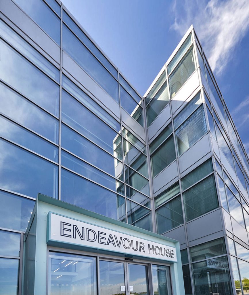
The existing building was largely defined by its grey, gridded curtain wall glazing and panelling and nondescript interior. The communal areas originally appeared dull and dated, were largely underused, and required uplifting to provide a more interesting and inviting feel.
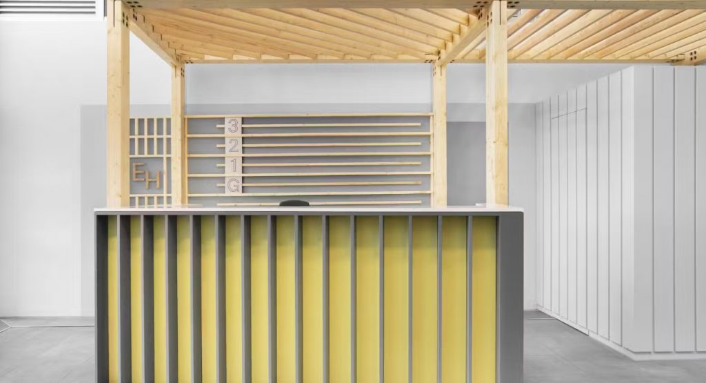
The proposal was to introduce a continuous framework (by way of a solid oak structure) to create a more distinctive sense of arrival and link the two existing atria at the front and rear, forming a stronger visual link across key ground floor spaces with a coherent, vibrant aesthetic. This visual link guides users with clarity from the reception desk and waiting area in the front atrium to the coffee/food point and seating area at the rear.
The continuous framework also acts in housing various much-needed functions, including a new reception desk and general store, a soft furnished waiting zone, banquette seating, coffee/food vending machines, bins, and a condiments counter – all consolidated in an integrated design solution.
The framework also acts in producing a clearer/more distinctive brand identity and as structure for new signage. A new font/logo was developed based on a reinterpretation of the original grid-like architecture, updated with a fresher contemporary look and feel.
Upward views were considered in the design, and paint bands on the ceilings are integrated with signage to provide clearer wayfinding on the upper levels, even when viewed from the ground floor.
The material palette was developed focusing on warm textures and cool tones that complement and enhance the greys/blues of the existing curtain walling and retained stone flooring. Soft furnishings, loose furniture and tabletops would act as accents to complete the new brand look.
Design Architect: Marco Curtaz
Collaborations: MHBC, Inside, Apex Joinery

